Great logo design blends simplicity and authenticity in a memorable way. Logos are the cornerstone of brand representation and combine with typography, colour, and other elements to form a visual identity. Well-executed identities help businesses connect with their audience and communicate with consistency, ensuring that a brand feels credible and trustworthy.
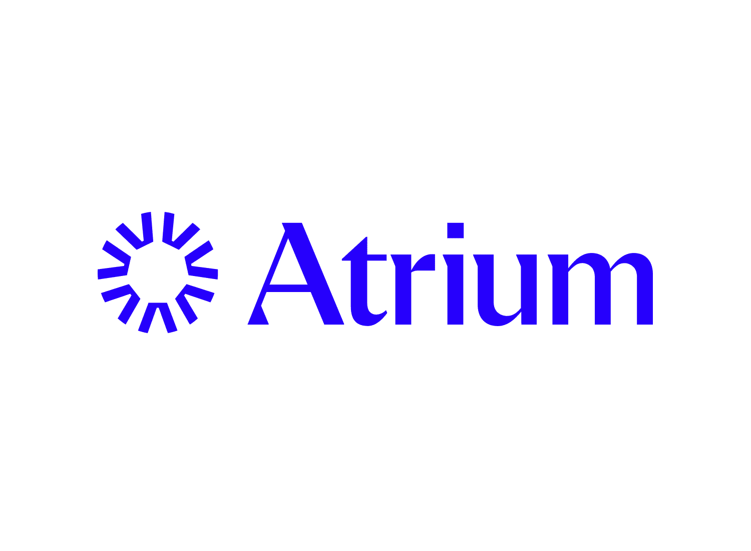


Atrium — the identity for this Toronto-based leadership development platform integrates bespoke 3D renders and photography to establish a standout art direction within a saturated competitive landscape.
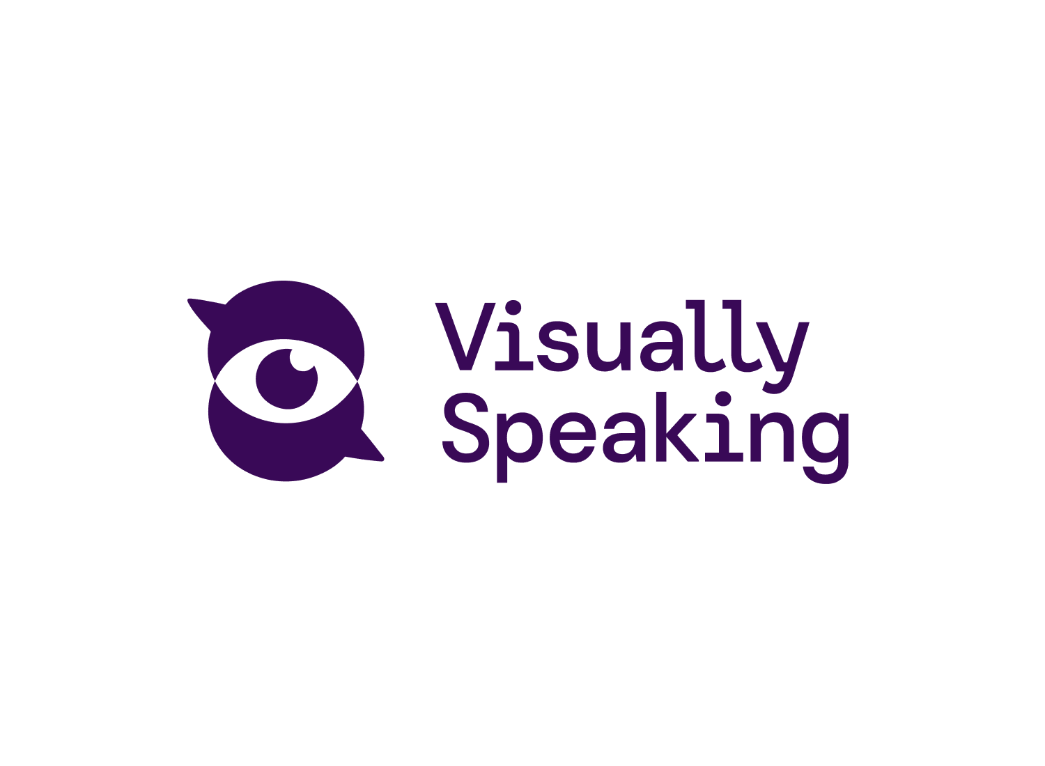
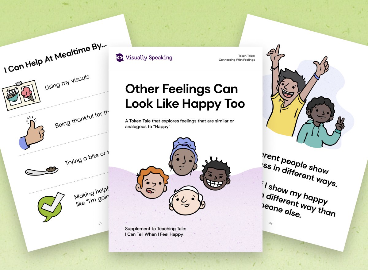

Visually Speaking — this friendly and approachable identity focuses on a custom illustration art direction that can be extended throughout all curriculum touchpoints in print & digital.
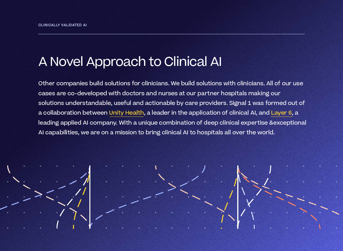
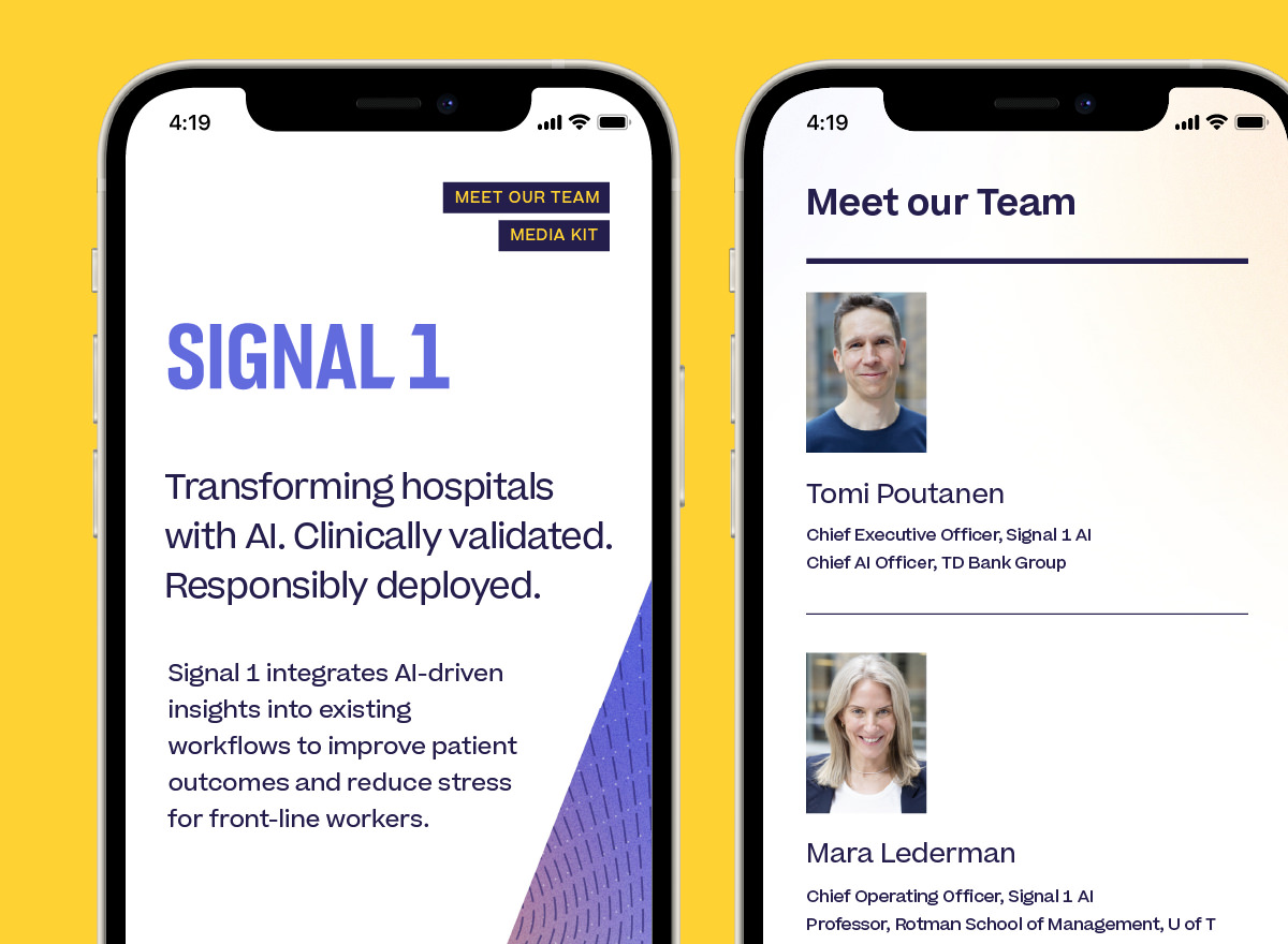
Signal 1 — this identity for a Toronto-based healthcare AI startup embraces whitespace and meaningful motion graphics to emphasize impactful brand messaging.

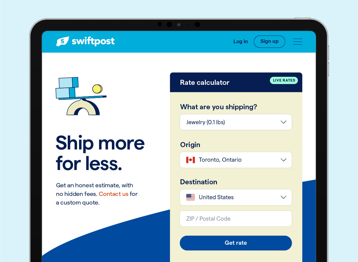
Swiftpost — this evolved identity system for a Canadian shipping company balances friendly visual elements with a professional and trustworthy art direction. View our Swiftpost case study
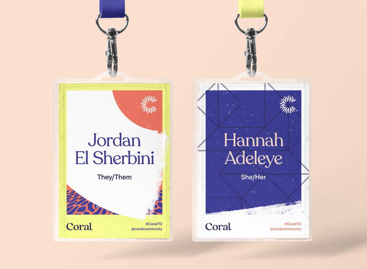
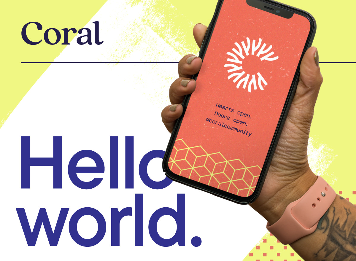
Coral Community (by Juno College) — this vibrant identity for an inclusion-driven coworking space is imbued with a welcoming, diverse, and energetic community spirit. View our Juno case study
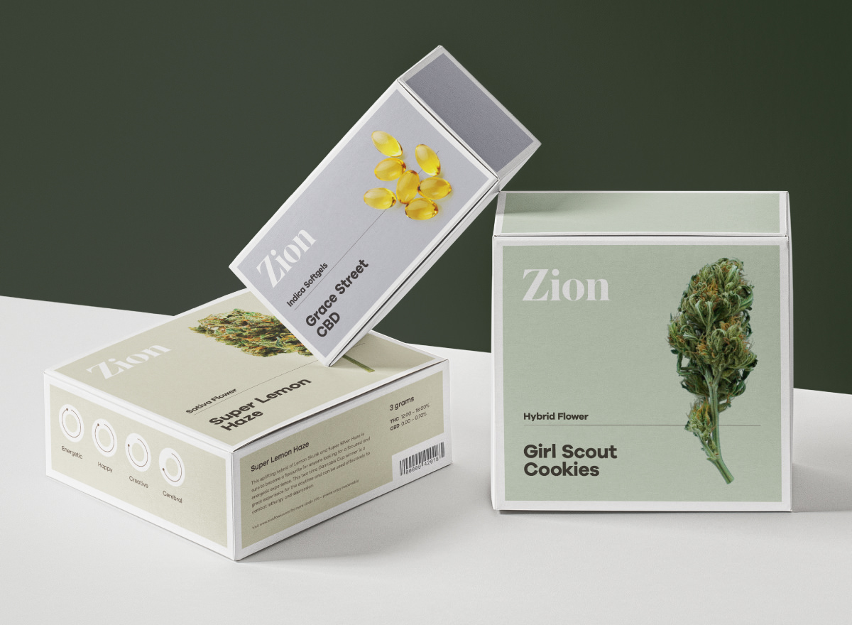
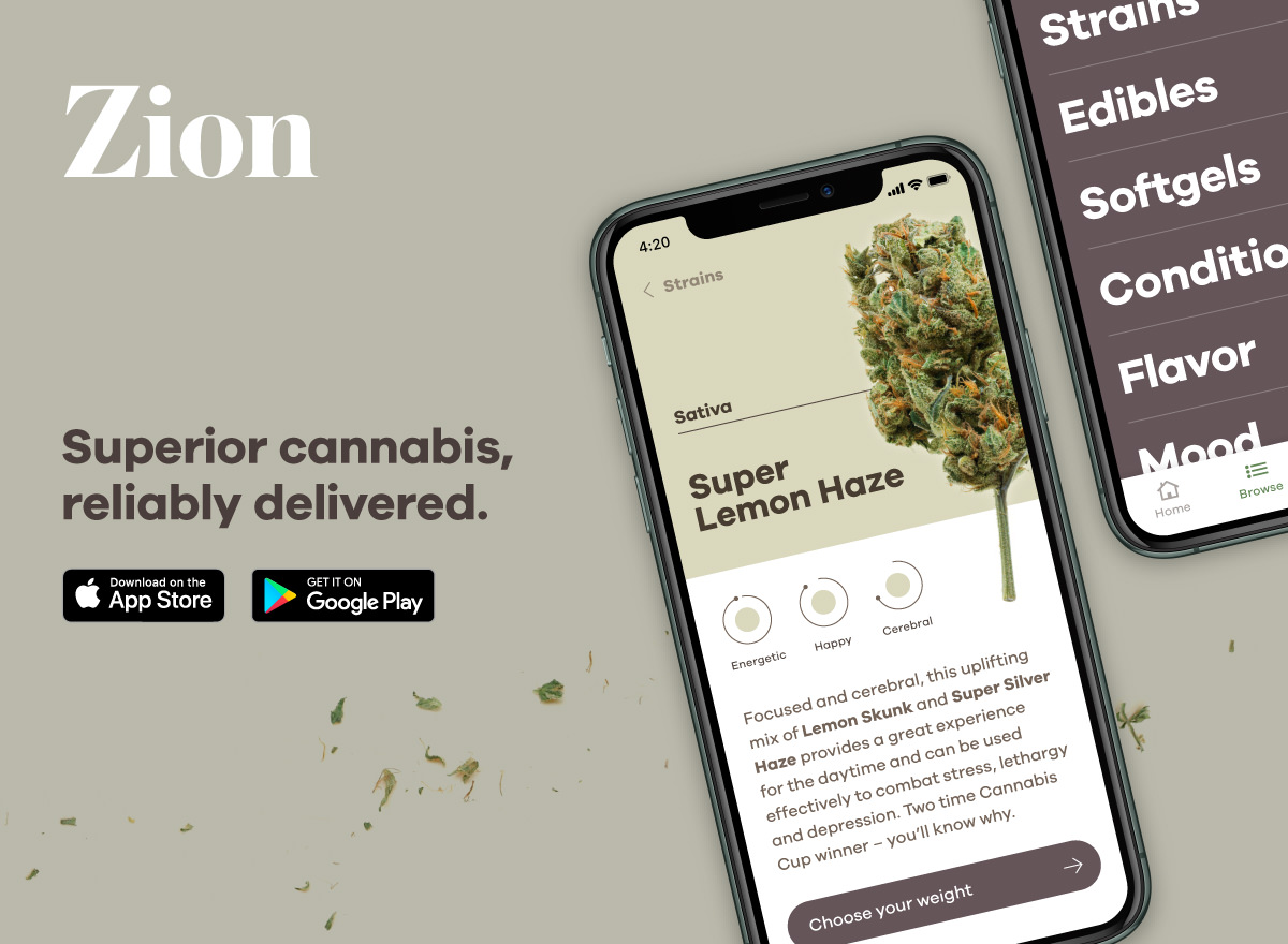
Zion Cannabis — this thoughtfully understated identity seeks to elevate the company’s positioning in a heavily saturated and rapidly expanding nascent market. View Zion e-commerce web design
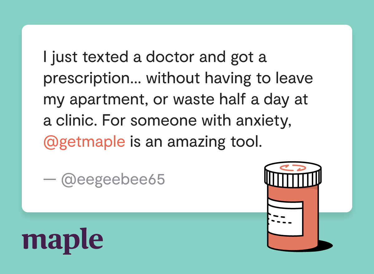
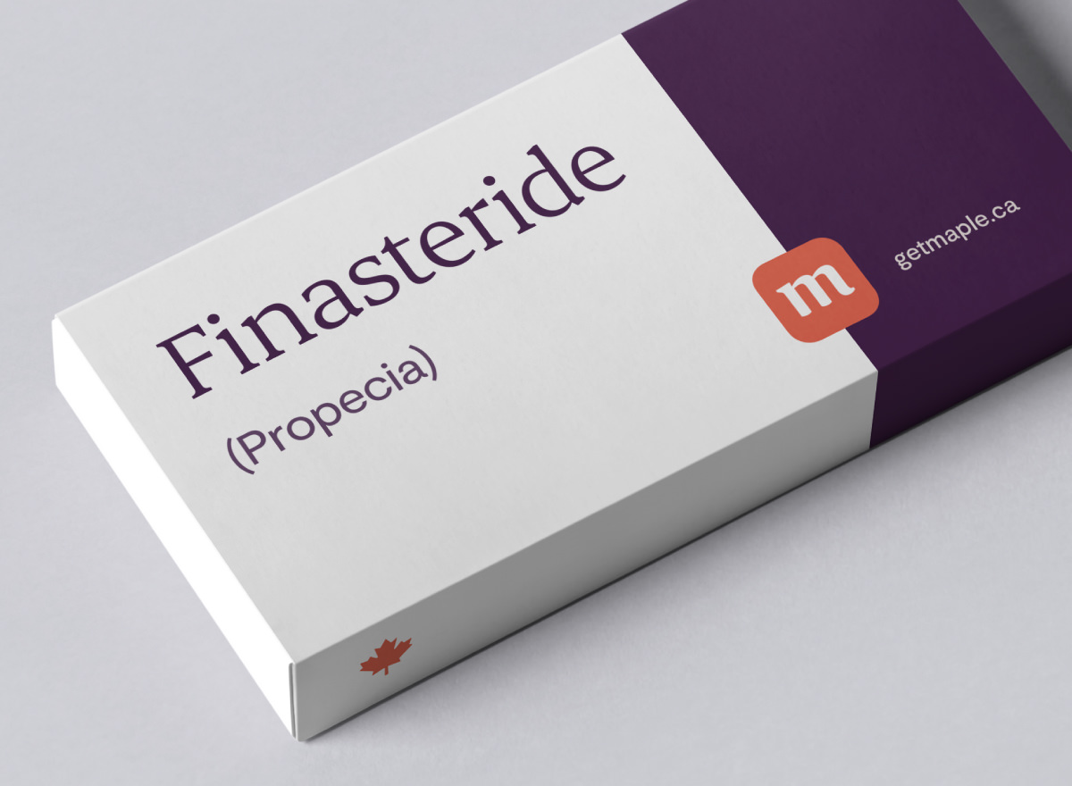
Maple Online Healthcare — this identity system combines distinct colours, charming illustrations, and contemporary typography to signal credibility and thoughtfully position the company in a rapid evolving competitive landscape. View our Maple case study


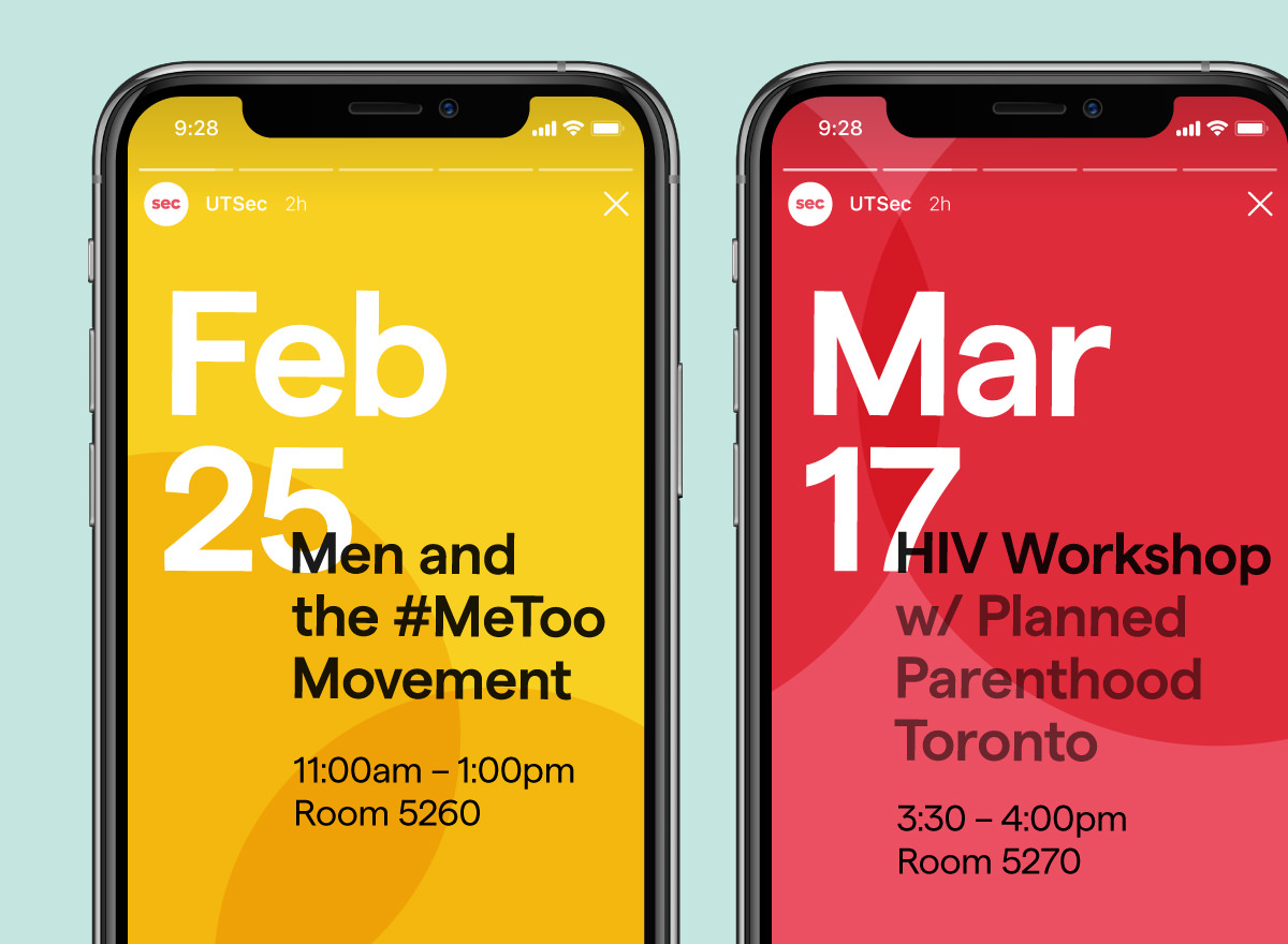
Sexual Education Centre at University of Toronto — this bright and welcoming identity brings positive energy and high visibility to important sex ed content for UofT students.
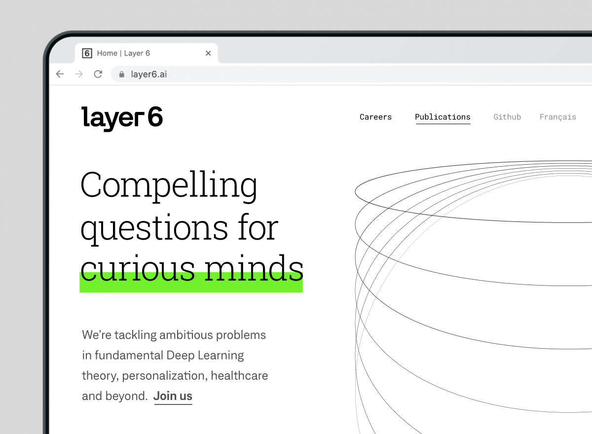
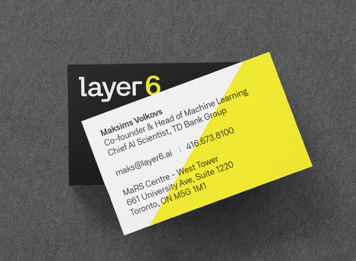
Layer 6 (TD Bank Group) — this understated identity system blends technical precision with a memorable visual personality. Supporting linear elements represent the processes and concepts of contemporary machine learning. View our Layer 6 case study
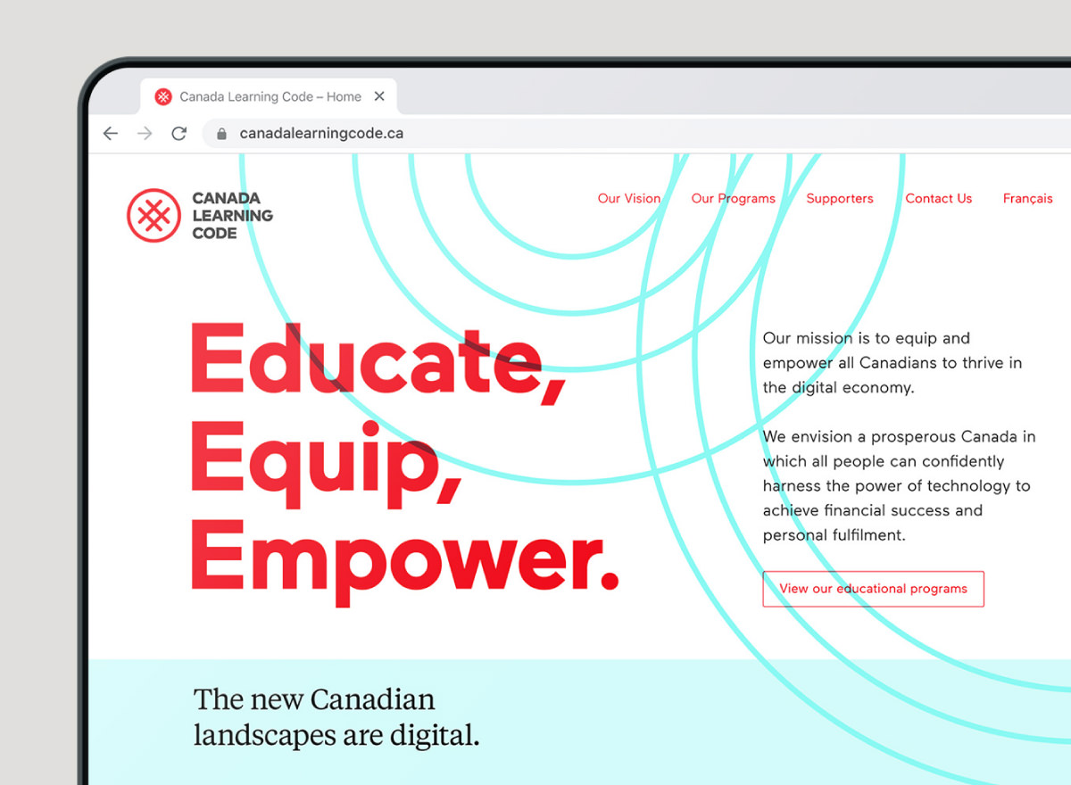
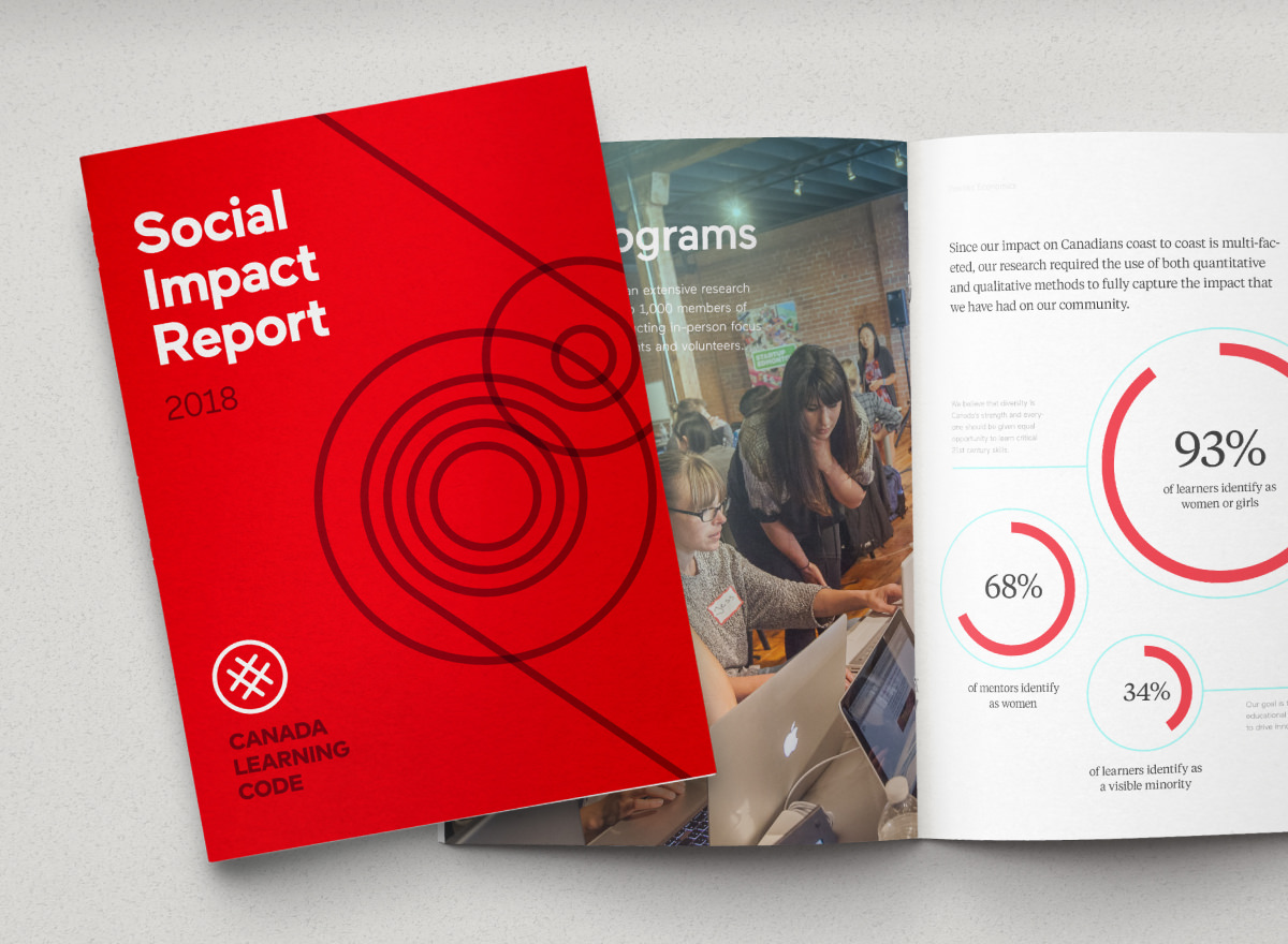
Canada Learning Code — this identity builds upon the brand foundation established by Ladies Learning Code and introduces new colours and visual elements to represent the emerging digital landscapes in Canada. View our CLC case study
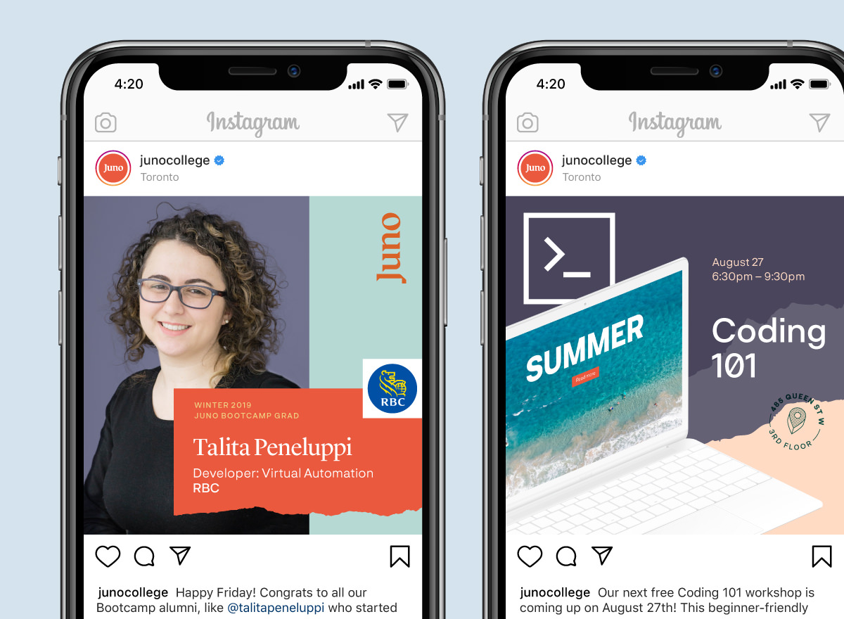
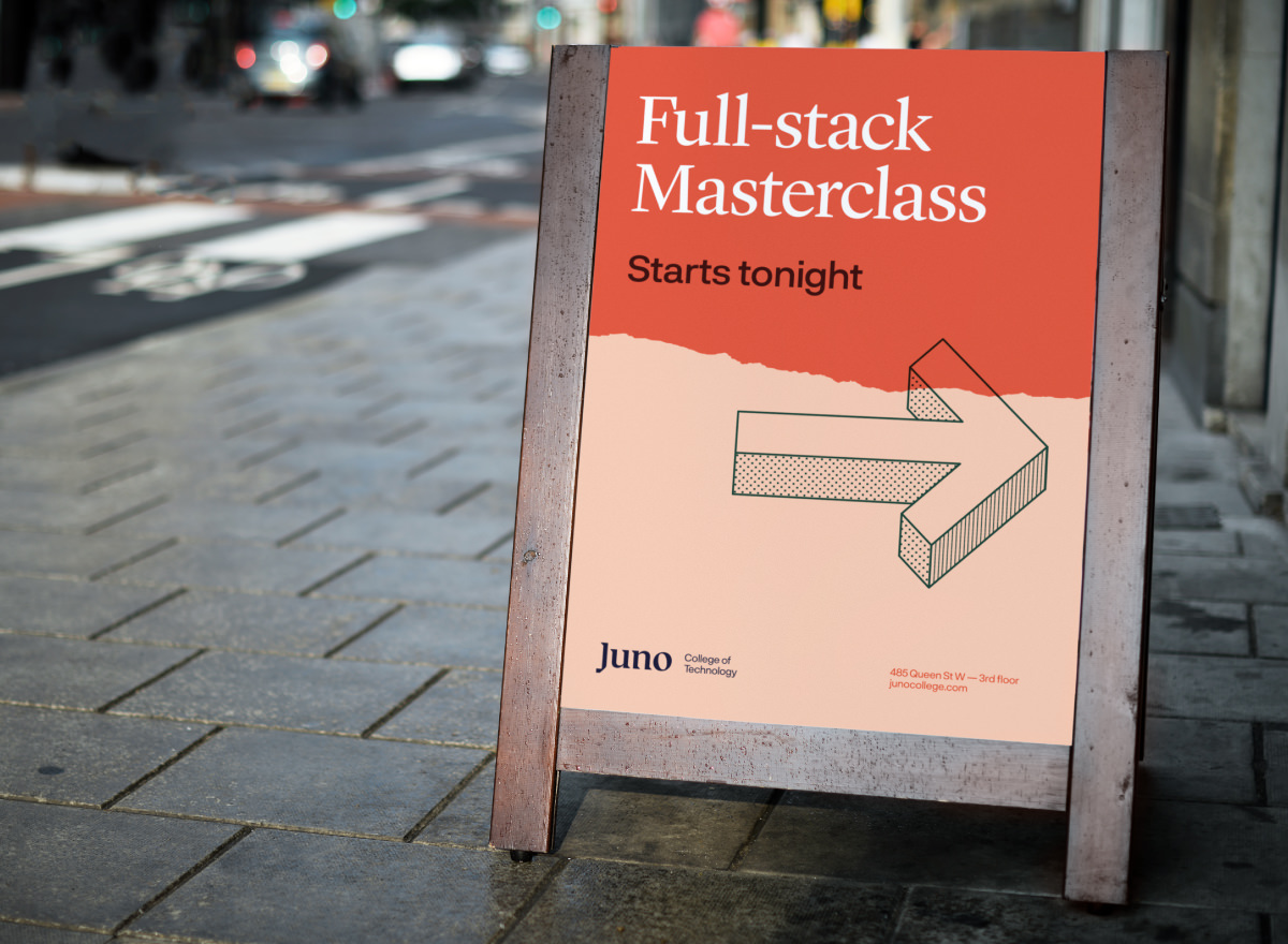
Juno College of Technology (formerly HackerYou) — this dynamic identity system was created to resonate with Juno’s diverse audience of young learners and job seekers. A unique colour palette and extensive library of visual elements were provided to the internal design team. View our Juno case study
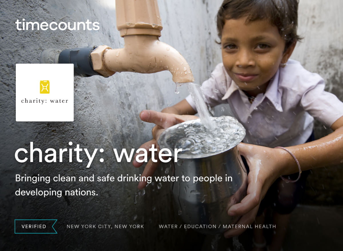
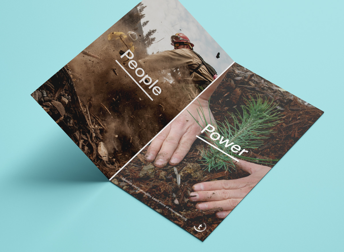
Timecounts — this identity uses clear typography and confident whitespace to emphasize authentic brand photography and primary messaging. Its distinct brand icon is meaningful and memorable. View Timecounts web app design
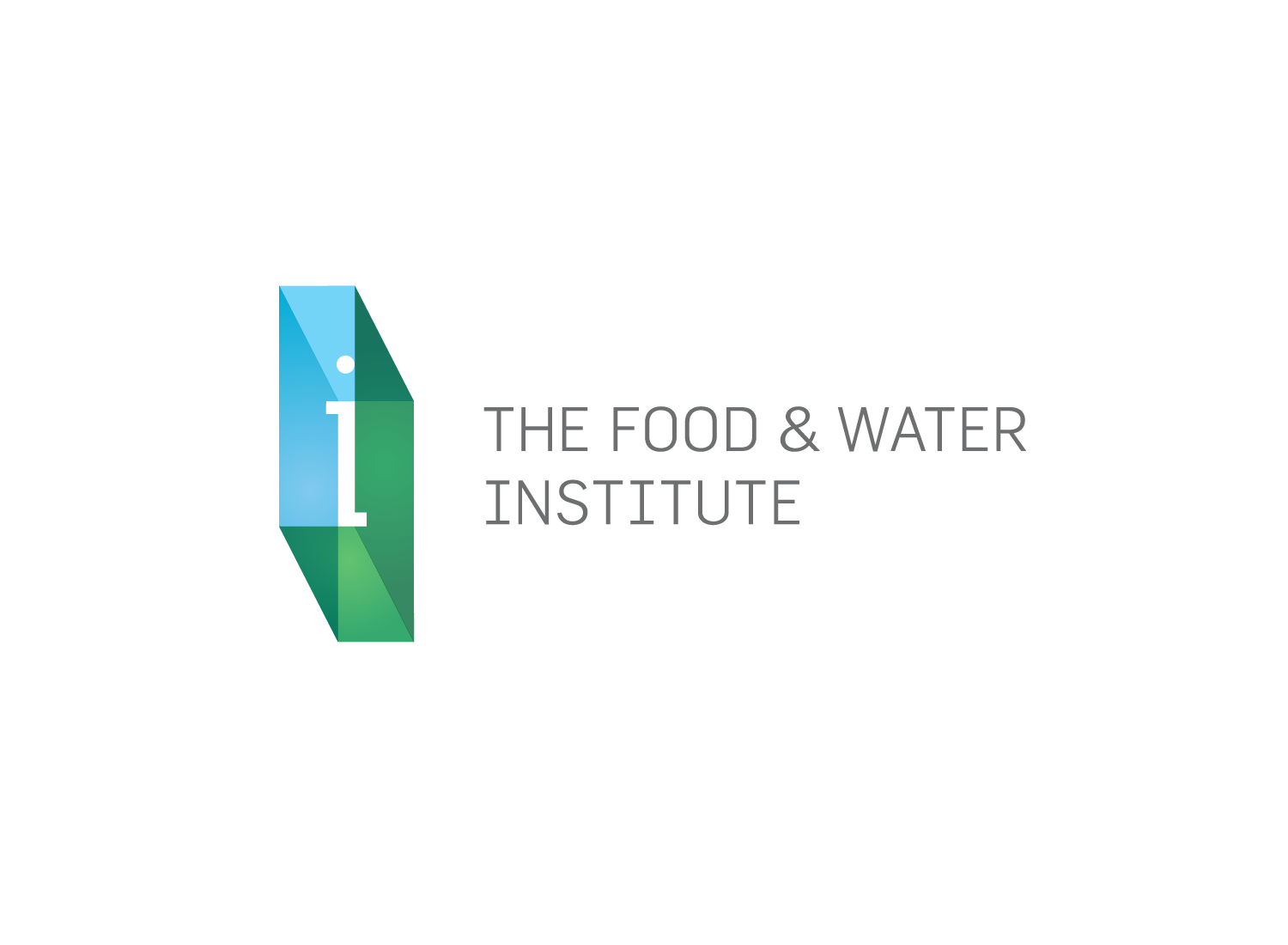
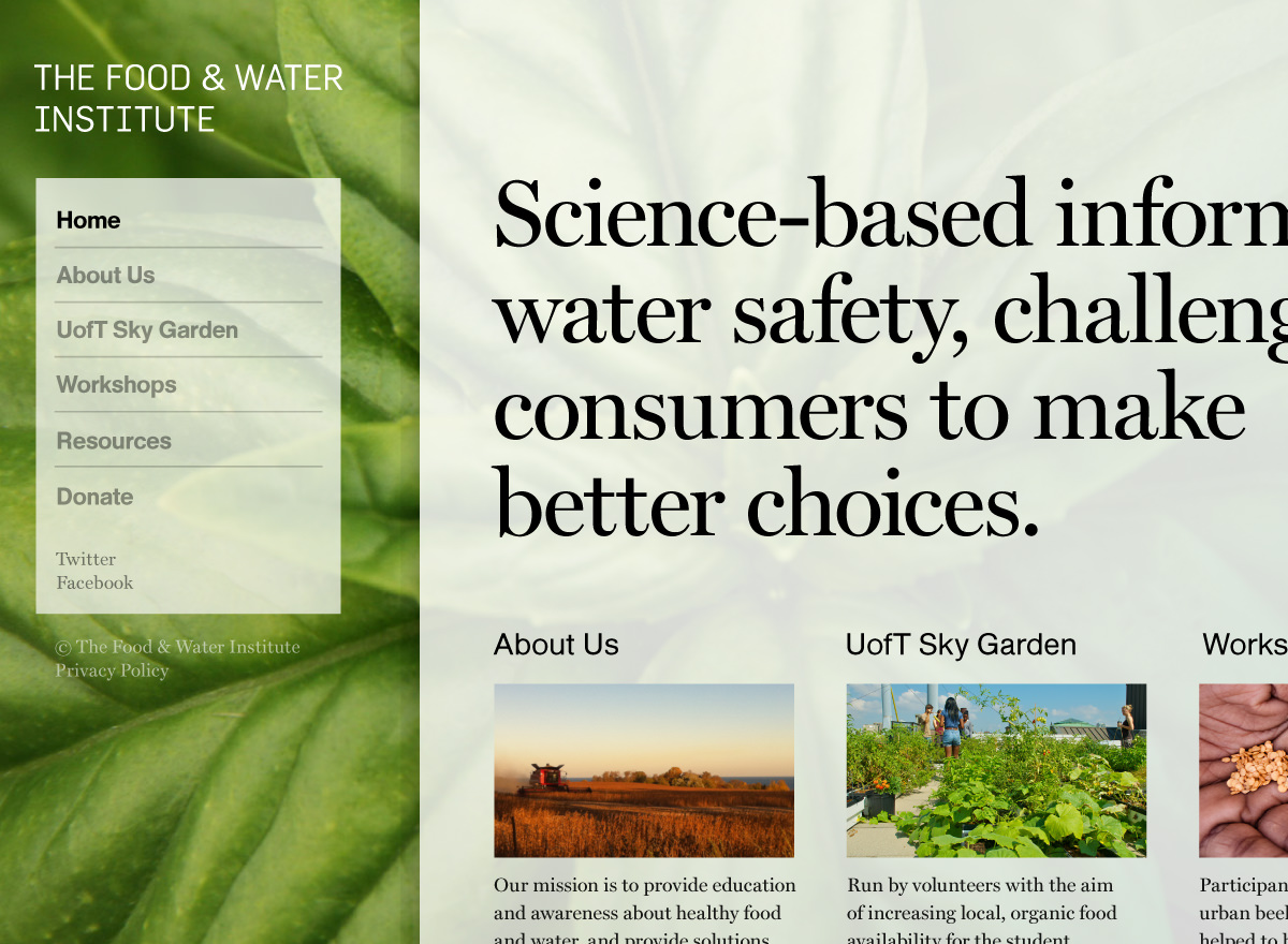
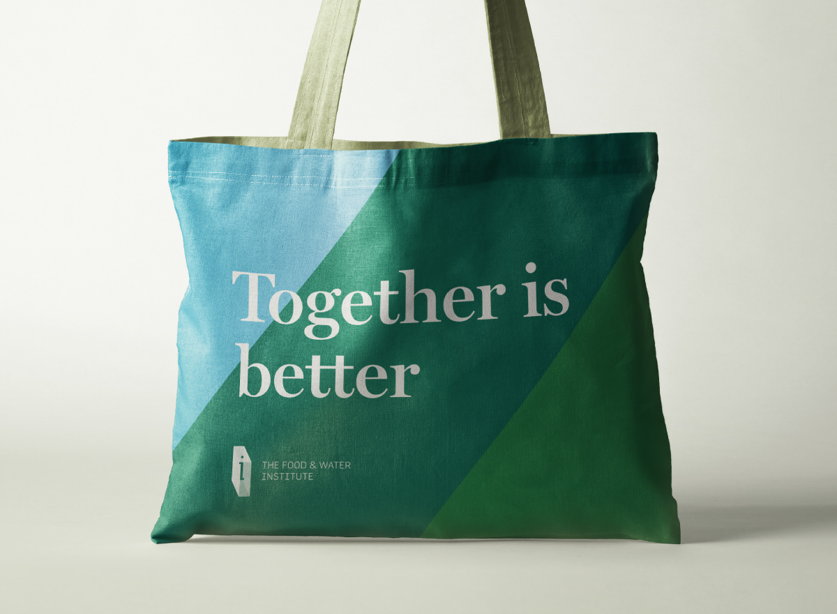
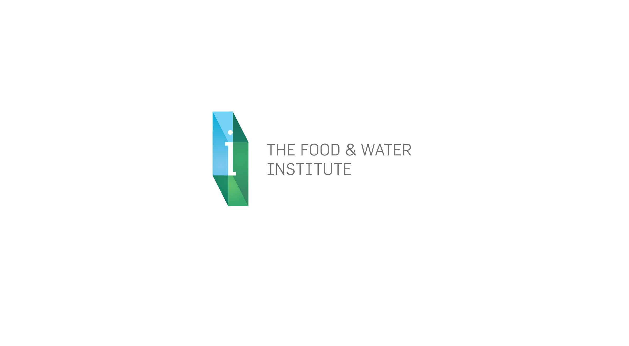
Food & Water Institute — this welcoming identity provides an accessible and professional platform for important workshop announcements, industry reports, and other useful information.
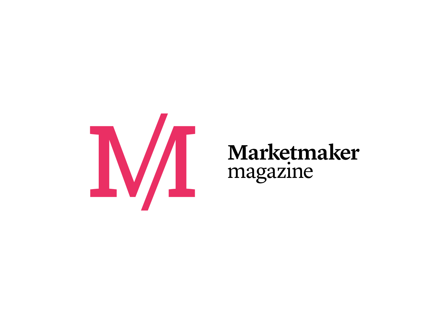
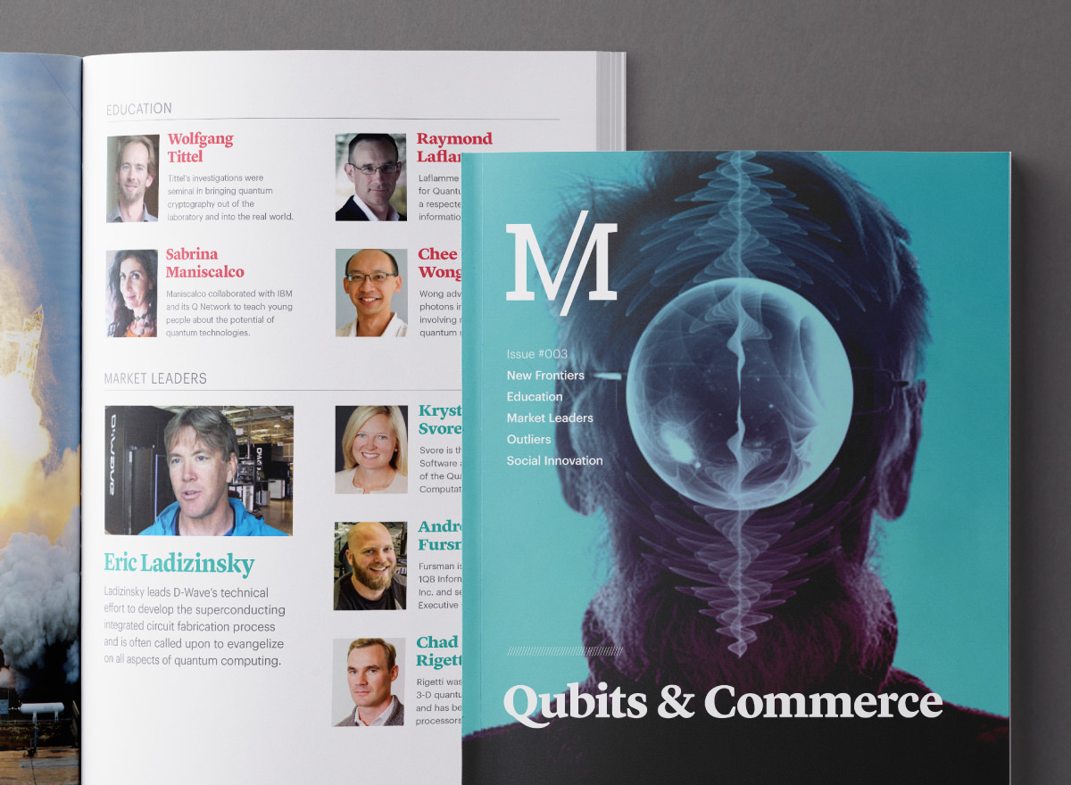
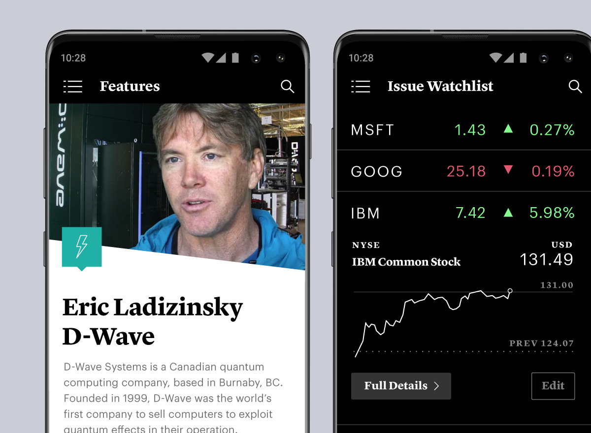
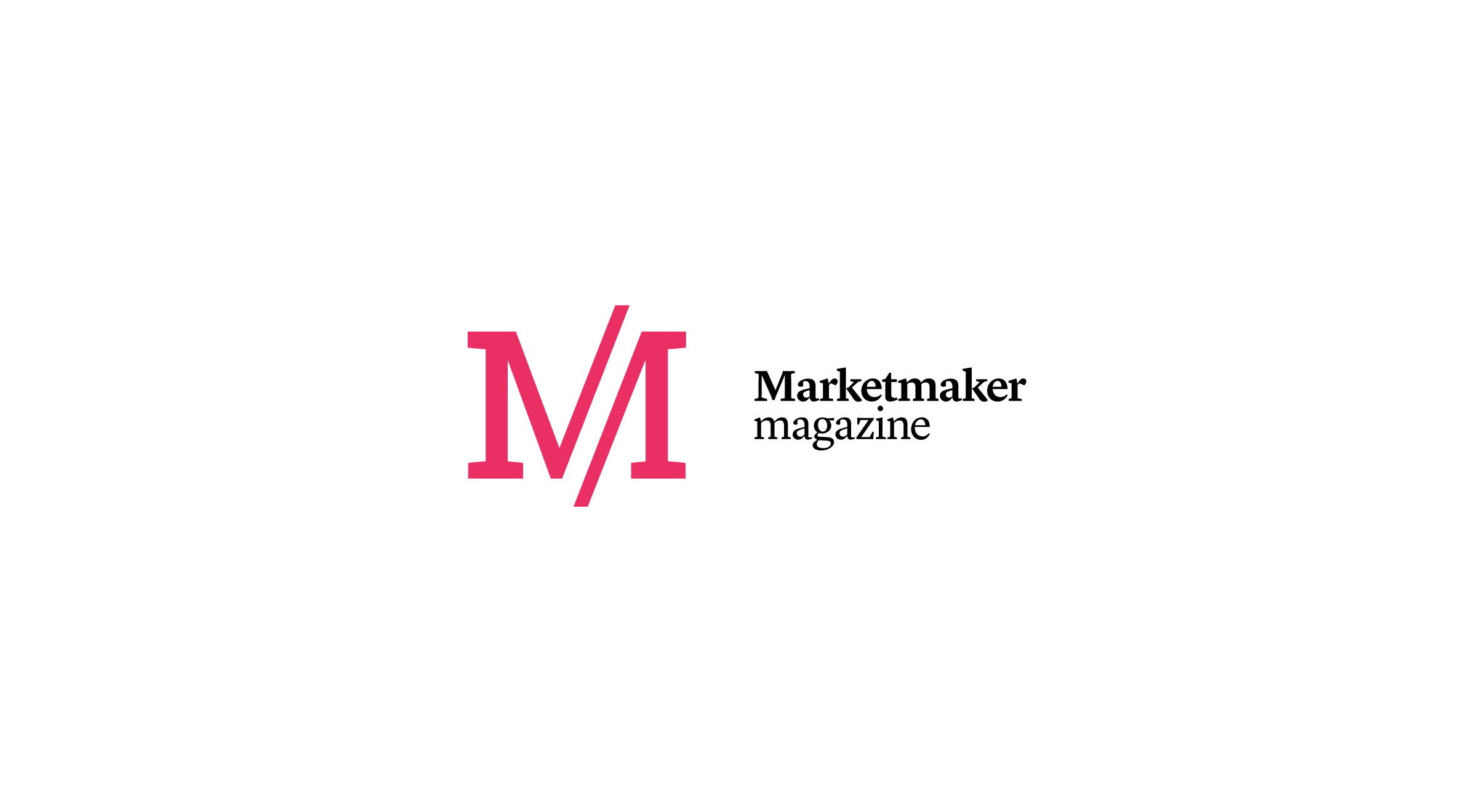
Marketmaker Magazine — this identity system was created to successfully brand and display long-form content in various digital and printed contexts. A suite of colours, icons, photography guidelines, and editorial templates were produced to enhance each issue.
— Previous
HomeNext —
Web & Product Design Studio Function